Thursday 4 February 2016
Thursday 28 January 2016
Final Evaluation Question 6
What have you learnt about technologies from the process of constructing this product?
Blogger
Photoshop is a photo editing software I used to create my final piece. This was an extremely efficient computer programme for the task I had to complete as it allowed me to customize my images to my own degree and also create my magazine to how I have pictured and planned it. The various tools I used in photoshop included the 'quick selection' tools for cutting my artist out of the image background and the various text effects in order to make my magazine look as eye-catching and professional as possible.
Slideshare is a site for sharing powerpoint slides. I used this to display things such as my magazine pitch and survey results. This was a handy site as it allowed me to upload my Powerpoints and embed them onto blog posts so I can present them on my blog.

UK Tribes is a channel 4 project that involves categorising the youth population into certain 'tribes'. I used UK Tribes to label the name of my target audience. This helps as it can also be a guide for me to research into the target audience I have chosen as it has further information about each tribe that allowed me to create a basic audience profile for my target audience.

Soundcloud is a free music distribution service that allows users to record, upload, and promote music. I used soundcloud to make my 20 song playlist. I used soundcloud rather than more popular streaming sites such as Youtube because Soundcloud is more prone to individual unknown artists whereas Youtube is full of mainstream music. Soundcloud was also more helpful to me than Youtube because it allowed me to narrow down my search by genre of music which Youtube does not allow. Soundcloud allowed me to create a playlist of indie artists and then embed this playlist onto my blog.

For taking my images, I used a Nokia Lumia 520 and although I was able to edit the images to make them appear to have better quality, I do think my use of equipment was poorly chosen. As an improvement, I could have used a better camera as to capture better stock images for my magazine.
Sunday 17 January 2016
Saturday 16 January 2016
Final Evaluation Question 3
What kind of media institution might distribute your media product and why?
Director's Commentary Script: "The media institution most likely to publish and distribute 'Untouched' magazine would be Bauer Media Group. Bauer Media Group has managed more than 600 magazines across the globe and has published popular and critically acclaimed music magazines such as 'Q' and 'Kerrang!'. This media institution specialises in print shops, postal, distribution and marketing services. Having already established a reputation as Europe's largest individual publishing group, Bauer Media Group would be a good publisher and distributer for 'Untouched' magazine as it will be able to publish the magazine globally which would increase sales and the scale of readers.
Publishing and distribution companies have the role of making the product available to the general public. This involves manufacturing the physical copies of the magazine and then sending them off to stores and the various other locations the magazine is to be sold at. With the increasing popularity of online magazines, publishers will now even publish electronic versions of media products onto websites as well. Because Bauer Media Group both publishes and distributes media products in their services, they shall also distribute 'Untouched' magazine as well as publish it. 'Untouched' magazine will be distributed to companies who sell a wide range of popular magazines as this is where the magazine is most likely to attract a large audience. Companies such as this would be supermarkets and news agents. Subscriptions of the magazine will also be available so people can have the magazine delivered to their homes on a weekly basis.
The name 'Bauer' comes from the name of the family who have managed the institution for more than five generations. Since Bauer Media Group was once a tiny publishing house in Germany, this shows how far the company has come in five generations which raises the possibility of 'Untouched' magazine gaining a large audience. The words 'Media Group' rather than 'Publishing House' or 'Distribution Company' show the wide range of services Bauer Media Group offers to a variety of Media and that it does not just focus on magazines.
The money for 'Untouched' magazine would come from Bauer Media Group agreeing that the magazine is an investment that will be worth their money. This would include convincing Bauer Media Group with a range of persuasive communication such as a business plan and marketing ideas. 'Untouched' magazine is to be sold at a price of £2.50 per issue which is a cost suitable for my target audience and is also enough to gain a net profit from the magazine against the publication and distribution costs. Bauer Media Group would invest in the magazine using profit gathered from their previously successfully sold magazines such as 'Q' and 'kerrang!' and would then decide whether to fund 'Untouched' or not. Because Bauer Media Group is a publishing company, they would evaluate over 'Untouched' magazine and decide whether the magazine would be able to expand the Media Group further with sales. Bauer Media Group would also have contact with various financer that would be able to offer a loan for this investment. And if 'Untouched' sells well then Bauer Media Group would be able to pay off the loan with the interest. An investment such as this is a risk but with enough marketing, 'Untouched' magazine would have a chance against competitors. A trial run would most likely come in handy, with the magazine first being published for only a handful of issues to test whether sales predictions are likely to be met. Once this is successful, promotion would then be an ideal solution for increasing sales. Promotion would come from television and radio advertisements, and also adding advertisements into Bauer Media Group's already published magazines.
Magazines similar to 'Untouched' would be 'The Fly', 'Q', 'Indie' and 'Magnet'. This is because these magazines publish music similar to 'Untouched' and all have a target market of young adults. 'Q' magazine is published by Bauer Media Group which means 'Untouched' could be published in a similar way to 'Q' in order to gain more sales."


Friday 15 January 2016
Final Evaluation Question 2
How does your media product represent particular social groups?
My media product presents a young artist of my target audience age which is 17-30 years old. I have chosen this age because it's important that the artist I have chosen relates to my target audience as this will make the article more likely to catch my target audience's attention. The artist is called 'Billie Wells' which is a name I came up with that sounded both memorable and unique. It's a subtle name which suits the indie genre and doesn't stand out as much as names such as 'Madonna' or 'Beyonce' though I felt this was suitable for the artist as she is supposedly as large as other mainstream artists. My artist uses a guitar as a prop which signals towards the acoustic style of music she will most likely play. The clothing my artist wears also matches the indie fashion and the style I made up during my research. The denim jacket in particular was a key part of the indie fashion that I mentioned and this use of fashion reaches out to indie fans which attracts their attention. The use of pale colours in the fashion was also part of my colour scheme and also adds to the subtle nature of indie. Relating to the fact that most indie artists are unknown, the use of subtle colours and the bland name link towards this idea. I even edited certain aspects of the images on Photoshop CS6 in order to give them these subtle colours. This included changing the colour of the denim jacket so it suited the blue used in the colour scheme. And because of the poor lighting in my photoshoot, the unedited version of my image had a yellow tint which I then removed in photoshoot as I did not think it suited the mellow tone of my cover. The facial expression of my artist is angry and sad at the same time which relates the the featured article's topic of her past struggles with record labels and betrayal.
Comparisons
Below is a picture of the artist known as Birdy who is to be compared with Billie Wells. I have chosen Birdy because she plays music belonging to the indie genre and would be considered similar to Billie Wells in numerous ways. Birdy is 19 years old and therefore matches my target audience. I will be comparing the photoshoot image of Birdy to an image of Billie Wells used on my double paged spread.

Similarities would be that both artists are within an age related to my target audience. This is important because a lot of people will become a fan of an artist they can relate to. And in many cases this would include having the same age and lyrics that the listener can understand and relate to. Both artists are of white ethnicity and both are English. In the images I have selected, both artists use a guitar as a prop which shows the style of music they play. Image is important with music artists as it tells an audience straight away what kind of genre this artist belongs to. Those who are fans of certain genres will become drawn to those who match the visual category of these genres. Although there is a differing of hairstyle, colour scheme, and fashion - it's obvious that these two artists belong to the indie genre due to their unique attire and posture. Other differences lie with the facial expressions both artists use because where Billie Wells has an expression which displays anger and hurt as she looks away from the camera which is an action a lot of people do when they're too disgusted to make eye contact; Birdy is looking directly at the camera with an innocent and lost look on her face. A facial expression is important for a magazine as it marks the emotion of the article to be read. Other differences between the two images lie with the Billie Wells image being a mid-shot and the Birdy image being a near full body shot.
Thursday 14 January 2016
Final Evaluation Question 1
In what ways does your media product use, develop
or challenge forms and conventions of real media products? (i.e. of music
magazines)
Before I began creating my magazine, I did
some extensive research into various well-known magazines. First, I focused on
annotating magazines unrelated to my chosen genre. This was at a point when I
did not know what genre I would choose. My annotations analysed the conventions
used in these magazines such as the layout and language used. It was here that
I decided that it was the indie genre I found most intriguing so decided to
move onto analysing certain aspects of magazines in the indie genre such as titles and chosen
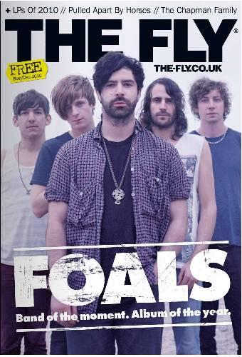
font styles. I mostly took inspiration from magazines such as Q, Rolling Stone, and The Fly. Here, I compare my own magazine to a 'Vibe' magazine since despite the genre difference, I felt they both had similar designs. Gaining a well-knowing of the conventions used in current popular magazines on the market was important for inspiration as the majority of large magazines do use the traditional magazine conventions. Other uses of research that I used would be a questionnaire taken by my class mates. This allowed me to see what people want in a magazine and what catches their attention.
My magazine matches indie genre conventions because of its unique feel. Rather than following the traditional magazine layout, I decided to change it slightly. Rather than having a large bold font for my masthead, I chose Birch as I felt it most suits the unique style I was aiming for in this magazine. Several lighting and editing techniques I used on the cover were also unusual. These would include the 'smart sharpen' and 'diffuse' tool I used on my main model image to take away the noise created as a result of poor lighting during the photoshoot. Other methods I used included changing the colour of the model's jacket to match the colour scheme and blurring the surroundings of the model so the image didn't look so sharp.
Another technique I used which doesn't suit traditional magazine conventions was my use of background. Usually, the background of a magazine will either be blocked into one cover, or it will have a subtle gradient. In order to produce a colour scheme though still allow the writing and image to be eye-catching to a reader, I added stripes in the background with strong colours that generate a colour scheme. In order for me to be able to use subtle pastel colours yet still allow the magazine cover to pop out to readers, I needed a white background to contrast against these colours. But this looked too plain and blank, so I added the stripes to make the magazine look more interesting.
Subscribe to:
Posts (Atom)